case_file.exe — /work/901osc.com Redesign
[LOADED]
_
X

901osc.com Redesign

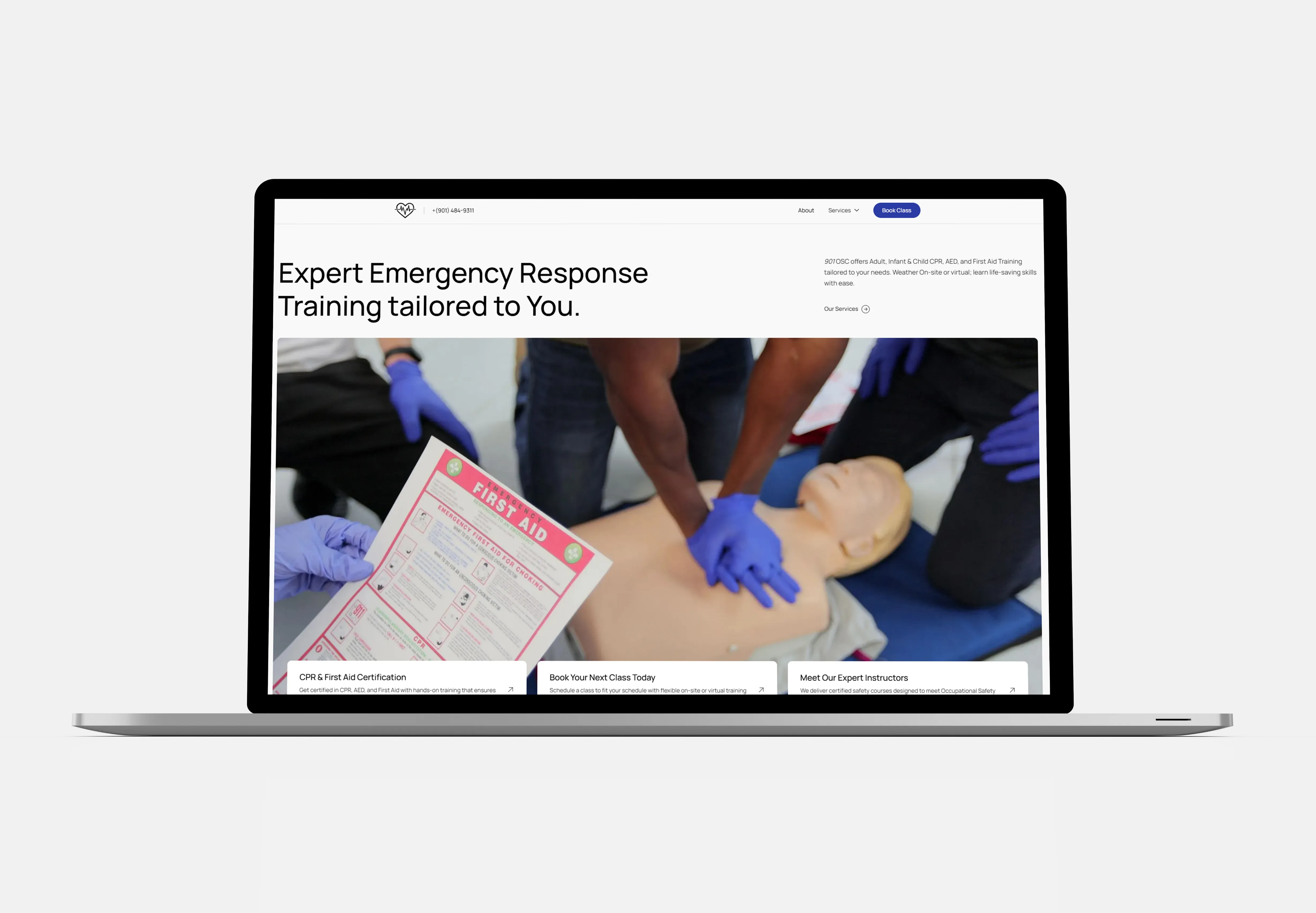
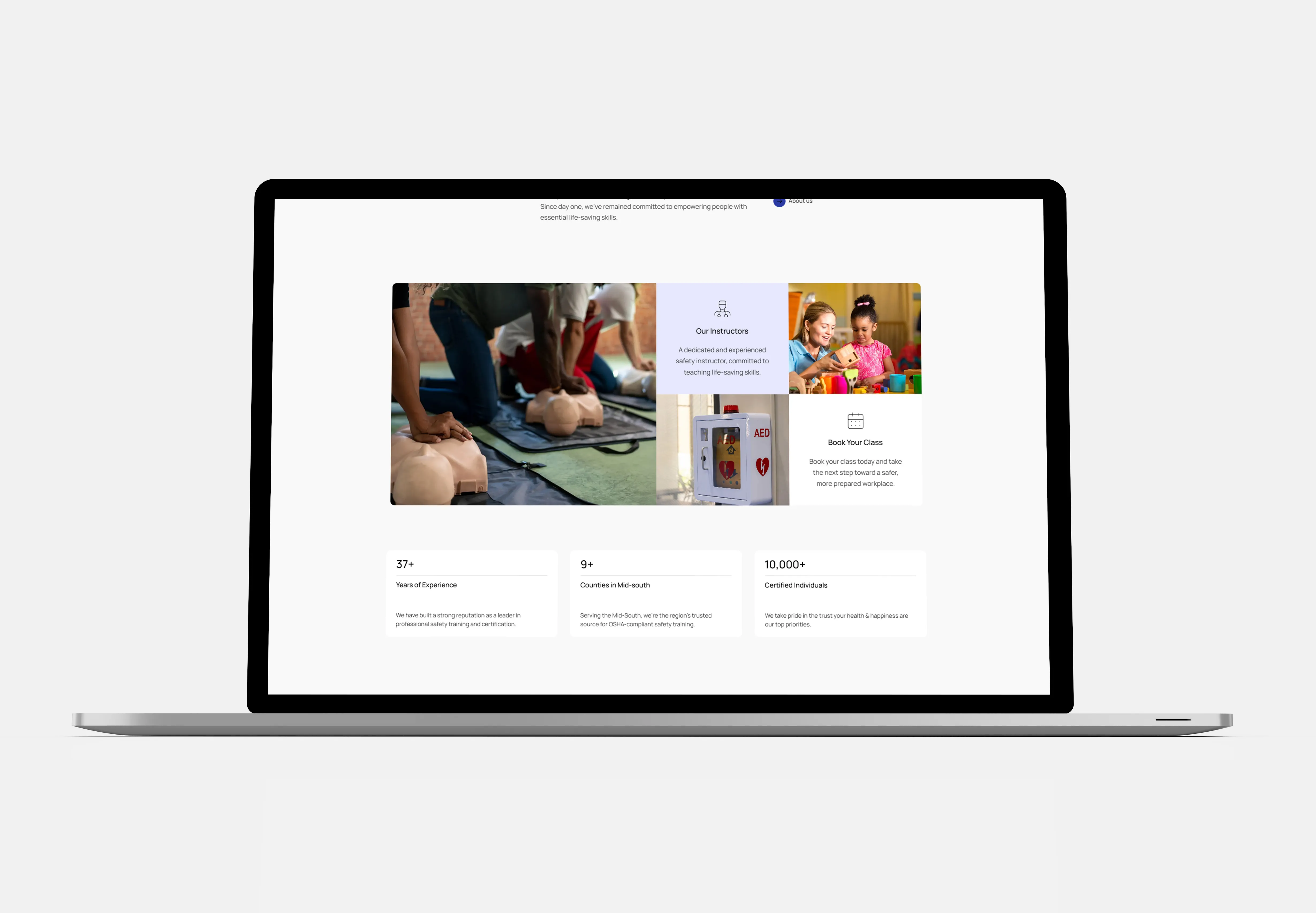
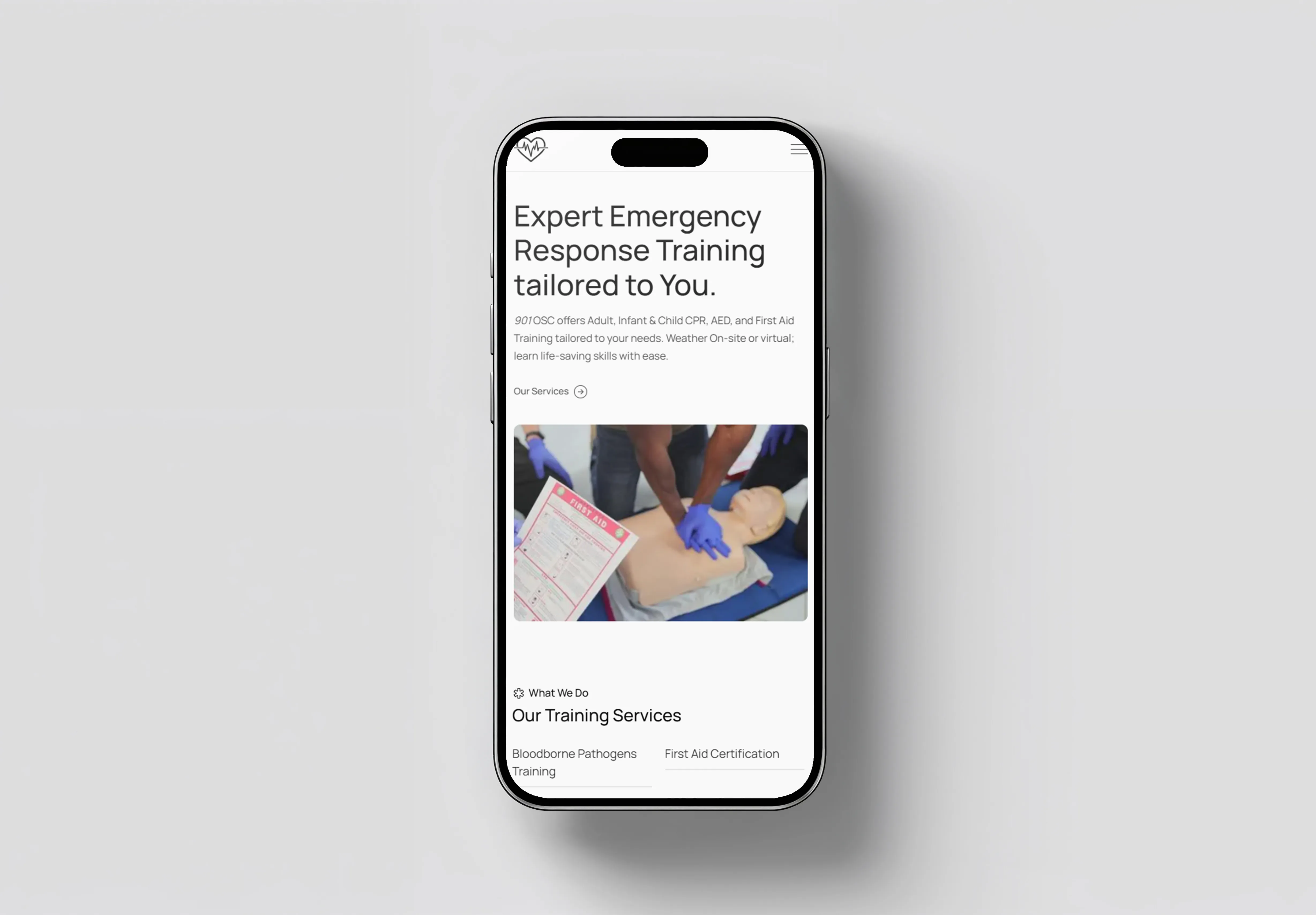
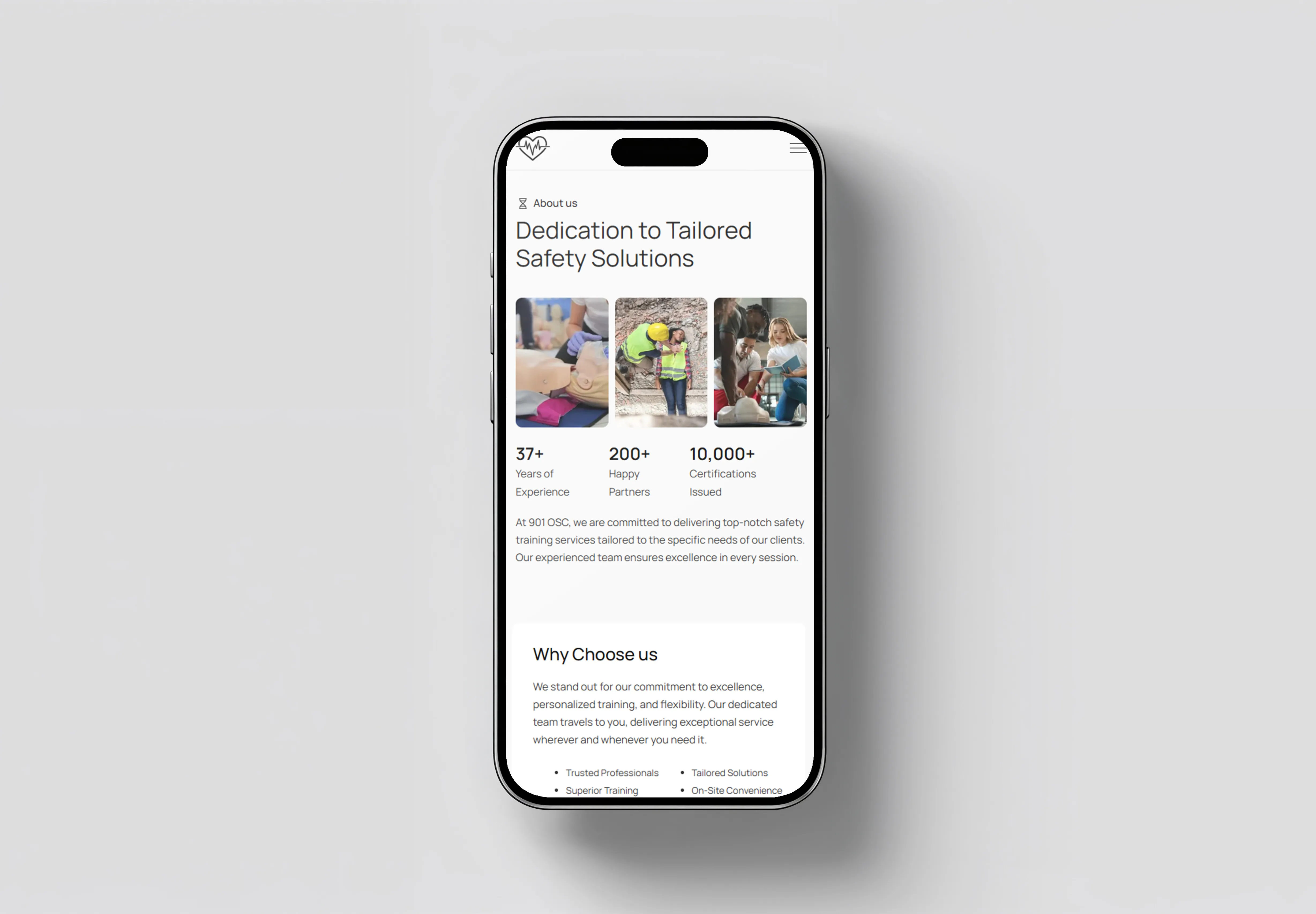
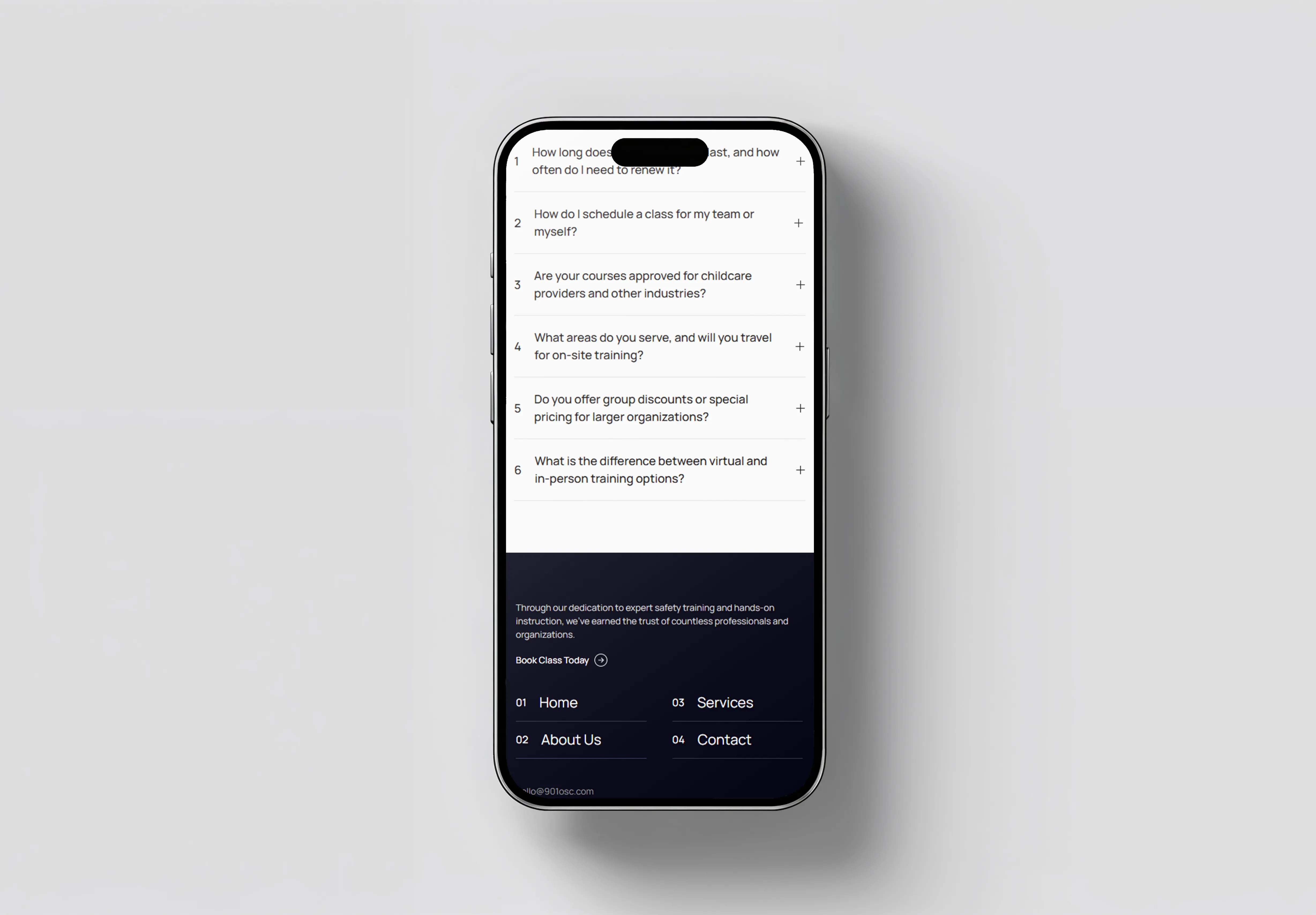
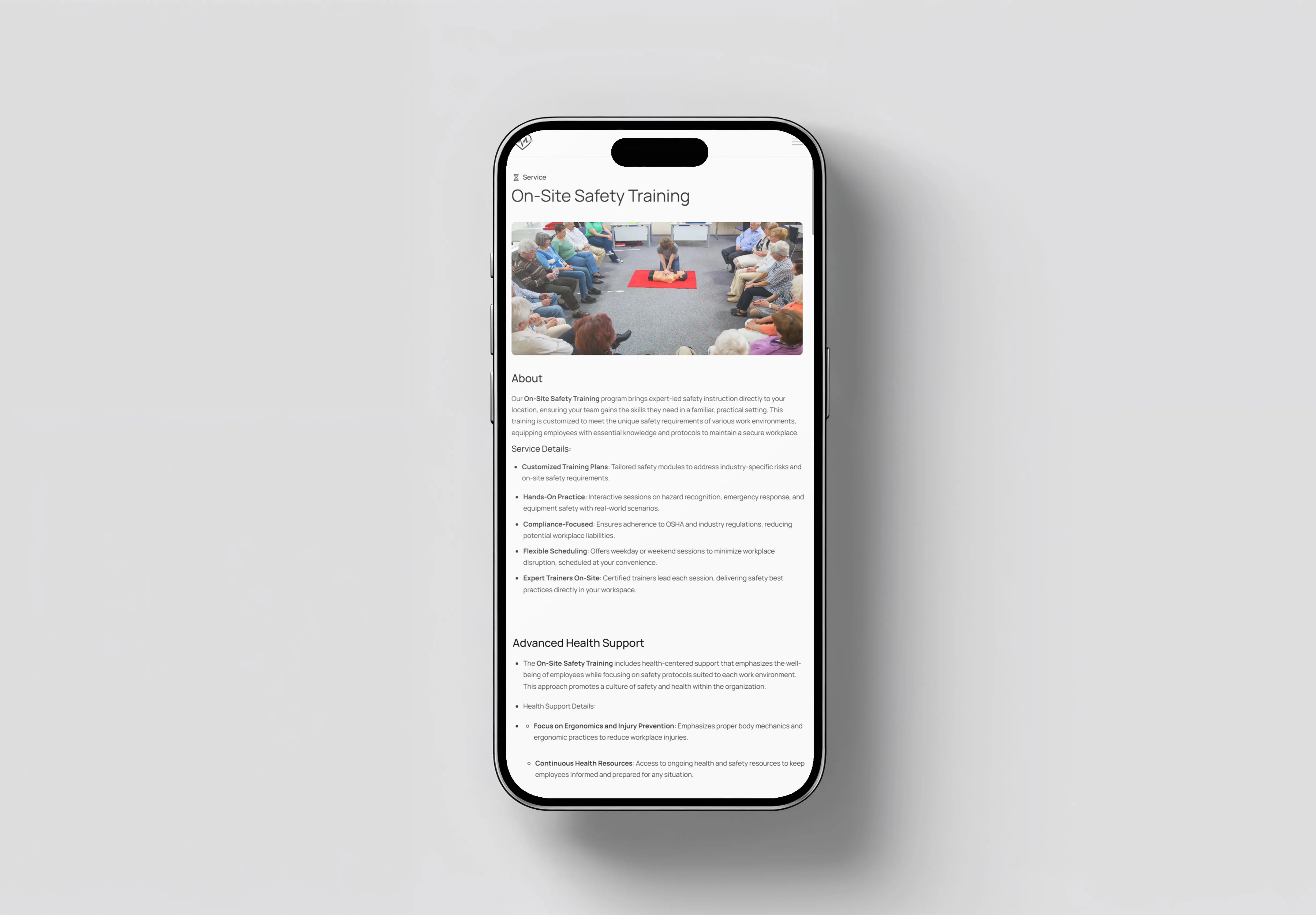
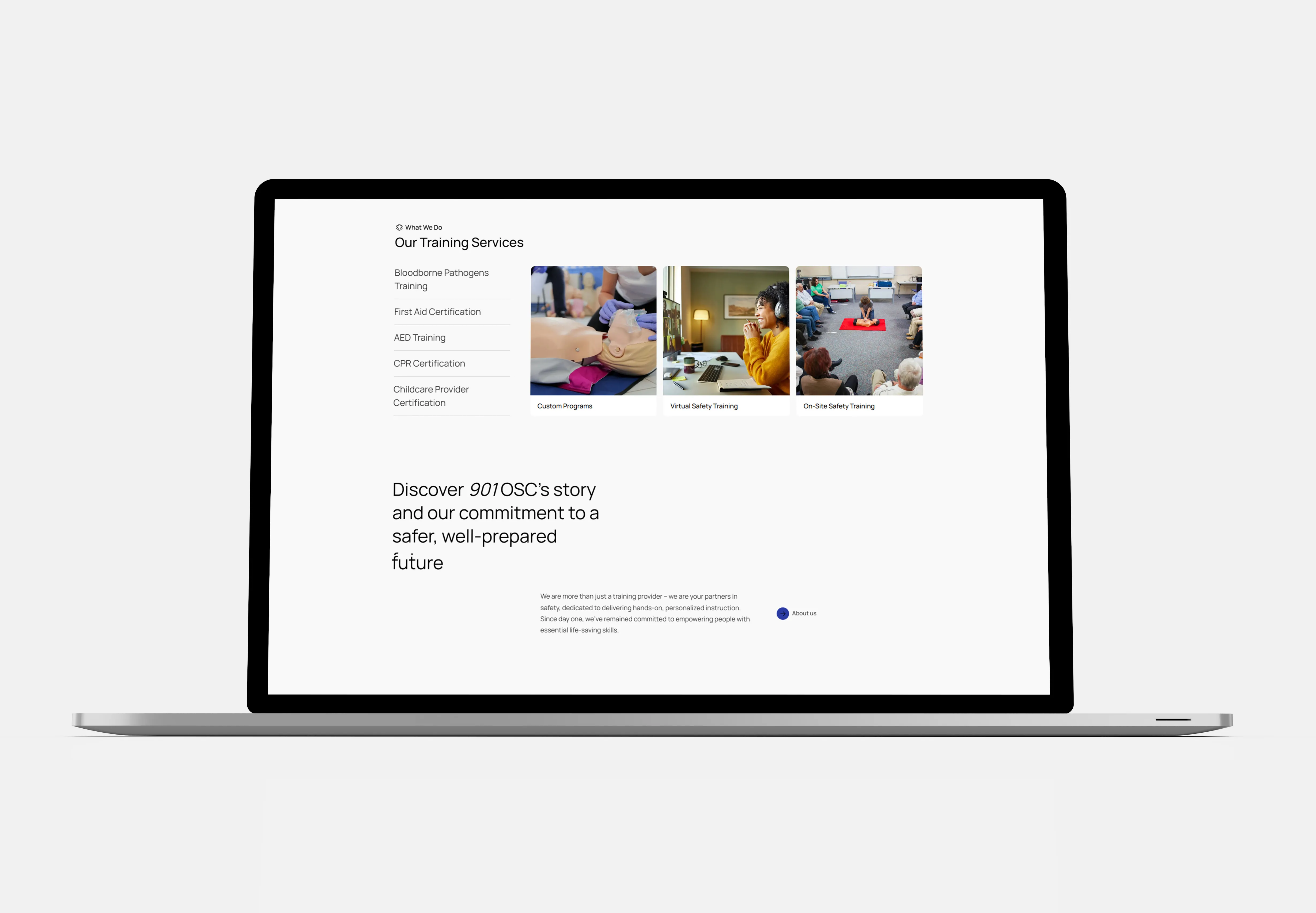
A clarity-first redesign for 901OSC, a compliance and safety training provider. The work restructured dense, regulation-heavy service information into a scannable experience that communicates authority without reading as institutional, helping prospective clients understand the offering and act on it quickly.

[ SYS_STAT ]
CLIENT
901osc.com
SECTOR
Healthcare / Compliance / Occupational Safety
YEAR
2023
ROLE
UX/UI Design, Web Design, Information Architecture, Visual Direction
DELIVERY
8 weeks
proc_uptime 00:00:21

Project Brief

01

> run brief.txt

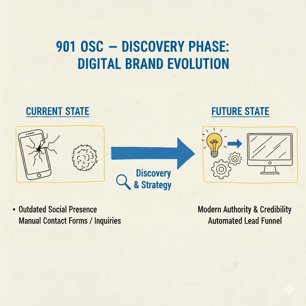
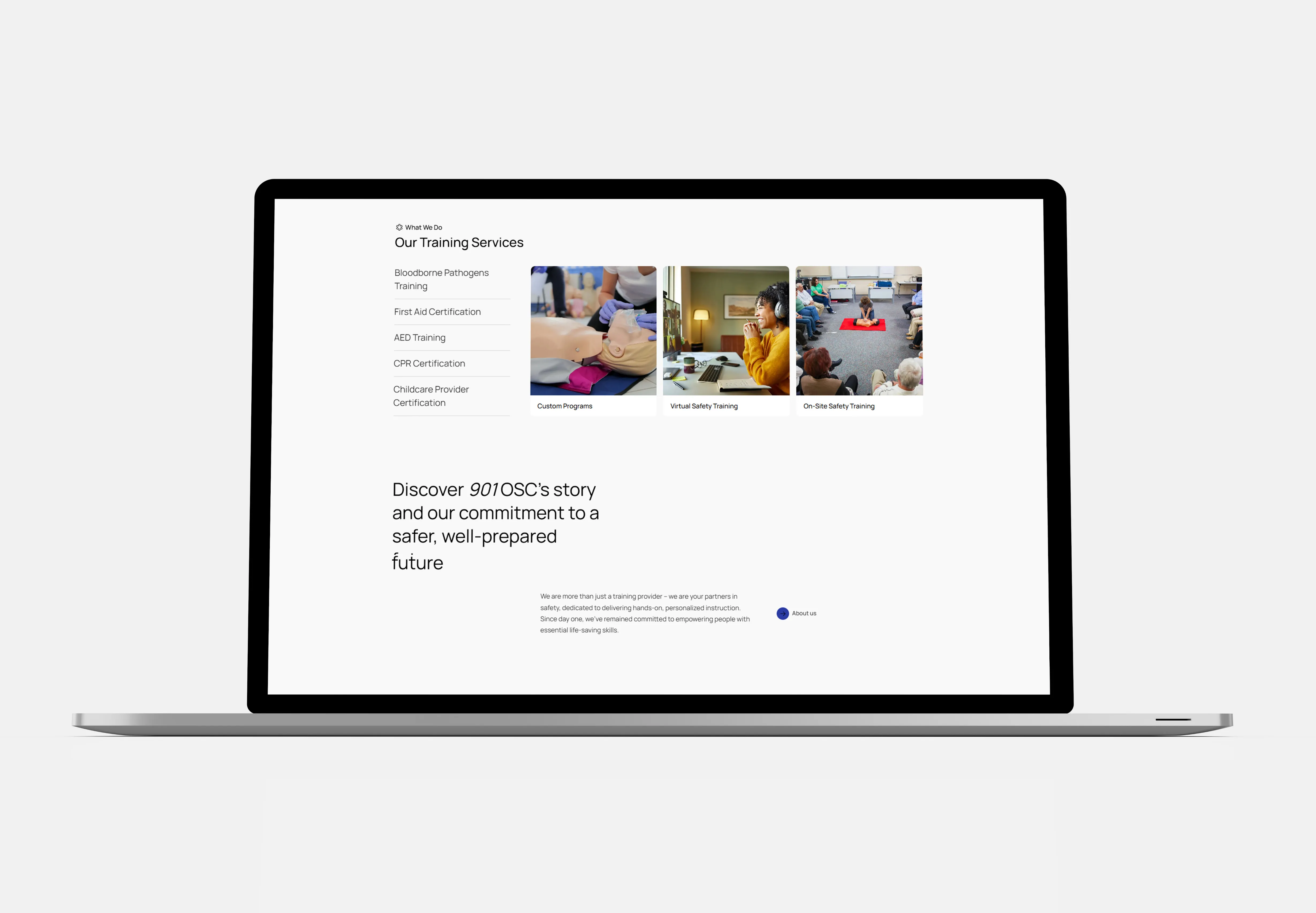
901OSC provides specialized services in a space where trust, clarity, and compliance are critical. Because the subject matter is inherently technical, the website needed to do more than look professional—it needed to help users quickly understand the organization’s services, navigate with confidence, and recognize the credibility behind the offering.

[ DELIVERABLES ]
UX Strategy
Information Architecture
Content Restructure
Visual Direction
Web UI System
Responsive Build

Discovery & Insights

02

moodboard.dir — 3 assets
[IDLE]
_
X
[ 01 ]
Challenge

The primary challenge was translating compliance-heavy and healthcare-adjacent services into language that felt understandable without losing authority. The experience also needed to build trust quickly, organize detailed service information into a more scannable structure, and present critical offerings in a way that felt professional, modern, and human rather than dense or overly institutional.

[ 02 ]
Audience
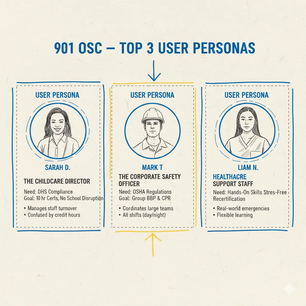
Healthcare administrators, organizational decision-makers, and prospective partners seeking compliance, safety, and workforce support services.
[ 03 ]
Discovery Inputs
Existing site content, stakeholder priorities, service documentation, competitive reference points, brand direction, and revised content architecture planning.
[ KEY INSIGHTS ]
01
Users needed immediate clarity on what 901OSC does and why its services matter.
02
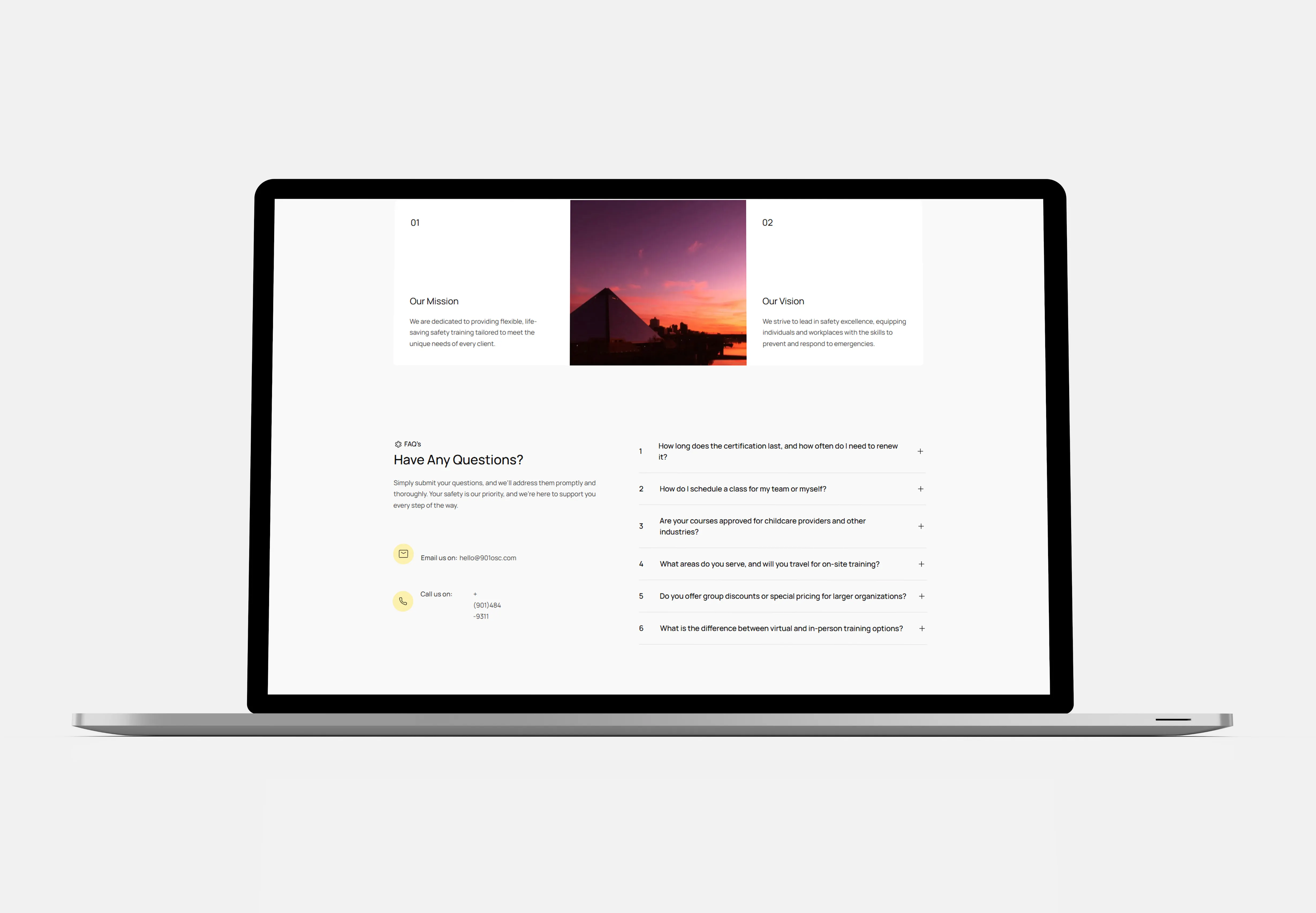
Trust and comprehension were closely tied to cleaner structure, simpler language, and stronger hierarchy.
03
A more accessible and human presentation would improve credibility without weakening professionalism.
[ RESEARCH ARTIFACTS ]
No items found.

The Approach

03

moodboard.dir — 3 assets
[IDLE]
_
X
Progressive Disclosure

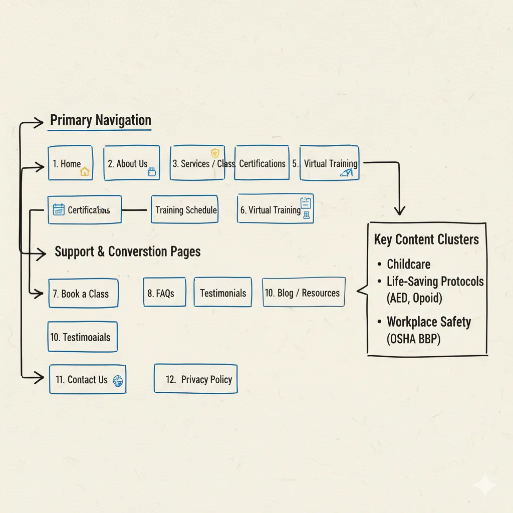
901OSC operated in a space where the stakes were high and the subject matter was inherently technical, which made clarity a central design requirement. The existing digital experience needed to better explain what the organization offered, who it served, and why those services mattered. Discovery focused on understanding the communication gaps, simplifying complex service language, and creating a clearer content structure that could help users move through the site with more confidence and less friction.

No items found.

Visual Systems

04

Font Selection

Heading Selection

Subheading Selection

Paragraph Selection

Color Palette
[ TOKEN: PRIMARY ]
#030abc
[ TOKEN: SECONDARY ]
#f2b705
[ TOKEN: SURFACE ]
#232323
[ TOKEN: GRAY ]
#9c9c9c
[ TOKEN: NEUTRAL ]
#f6f7f9
[ TOKEN: WHITE ]
#ffffff
Buttons
Book Onsite Training
View All Courses
Logo
[ ANNOTATED SCREENS ]

Solutions & Outcomes

05

[ SOLUTIONS ]
“Simplifying compliance, saving lives.”
The challenge was translating compliance-heavy healthcare services into language that stayed authoritative while becoming genuinely easy to scan and understand.
No items found.

[ Navigation ]

06

[ RELATED FILES ]

[ Contact ]

07

[ CONTACT ]
Start a project
[ RESPONSE WITHIN 48 HRS ]
> NAME:
> Email Address:
> Message:
[ OR EMAIL DIRECTLY — HELLO@AJWILLIAMS.INFO ]
Thank you! Your submission has been received!
Oops! Something went wrong while submitting the form.
boot.sh_ □ X
[ ]
Initializing0%