case_file.exe — /work/Triquest Management Website
[LOADED]
_
X

Triquest Management Website

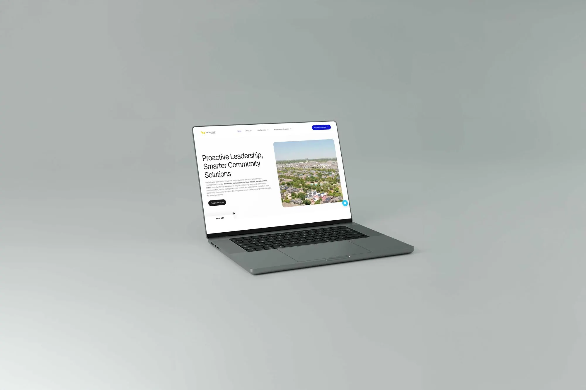
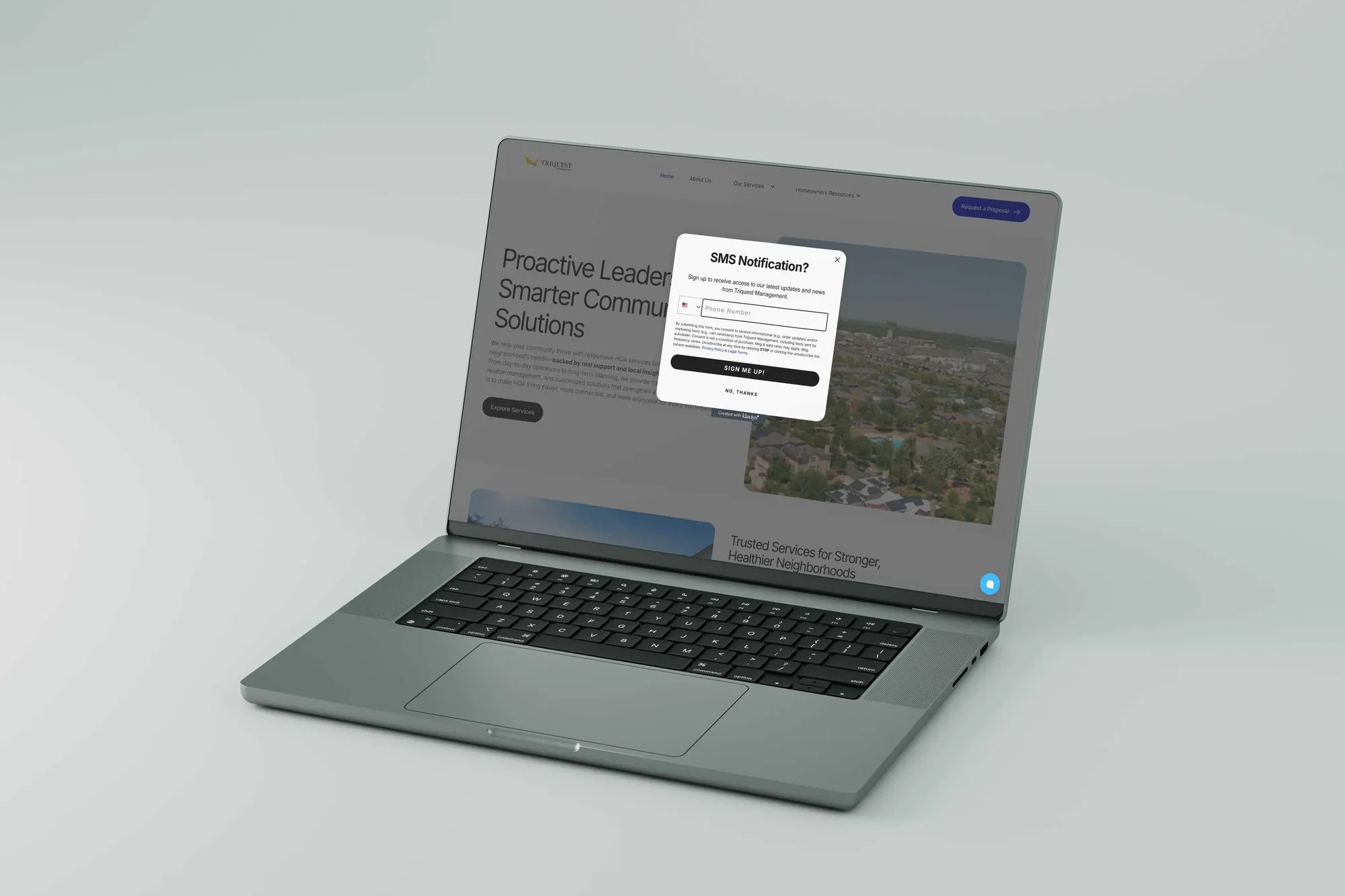
Triquest Management needed a clearer, more modern web presence that made its services easier to understand and positioned the company as a more credible, accessible partner for HOA communities. This project focused on restructuring the experience, refining the visual language, and creating a cleaner digital entry point for prospective clients.

[ SYS_STAT ]
CLIENT
Triquest Management
SECTOR
Property Management
YEAR
2025
ROLE
Product Designer
DELIVERY
10 weeks
proc_uptime 00:00:21

Project Brief

01

> run brief.txt

TriQuest Management, a Houston-based HOA management company, faced a critical business challenge: their digital presence had effectively disappeared after their legacy WordPress site went offline. This left the company invisible to potential clients and unable to support existing residents through digital channels.I was brought on as the sole freelance designer and developer to lead a full digital relaunch. The objective was to design and build a modern, automated website that would restore credibility, streamline internal operations, and serve as a reliable growth channel for new HOA management contracts.

[ DELIVERABLES ]
Logotype & Marque
Type System
Color Protocol
Motion Package
Web & App UI
Print Collateral

Discovery & Insights

02

moodboard.dir — 3 assets
[IDLE]
_
X
[ 01 ]
Challenge

The core challenge was presenting specialized HOA and property-management services in language that felt clear, accessible, and trustworthy without oversimplifying the business. The site also needed to improve its sense of credibility while avoiding a tone that felt overly corporate or impersonal, all while reorganizing service information into a format that users could scan quickly and understand with confidence.

[ 02 ]
Audience
HOA board members, residents, and prospective property management clients
[ 03 ]
Discovery Inputs
Stakeholder goals, existing website content, brand direction, competitive references, and site-structure planning
[ KEY INSIGHTS ]
01
Trust is the primary conversion driver for service-based management firms
02
Service offerings need to be legible and scannable for non-specialist audiences
03
A cleaner visual system can make operational complexity feel simpler
[ RESEARCH ARTIFACTS ]
No items found.

The Approach

03

moodboard.dir — 3 assets
[IDLE]
_
X
Progressive Disclosure

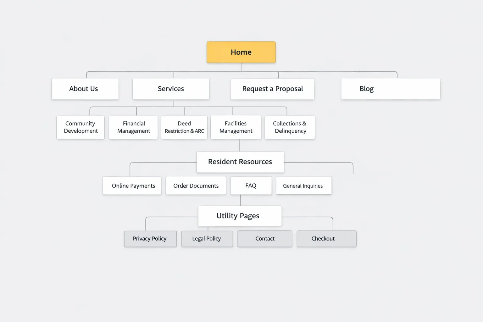
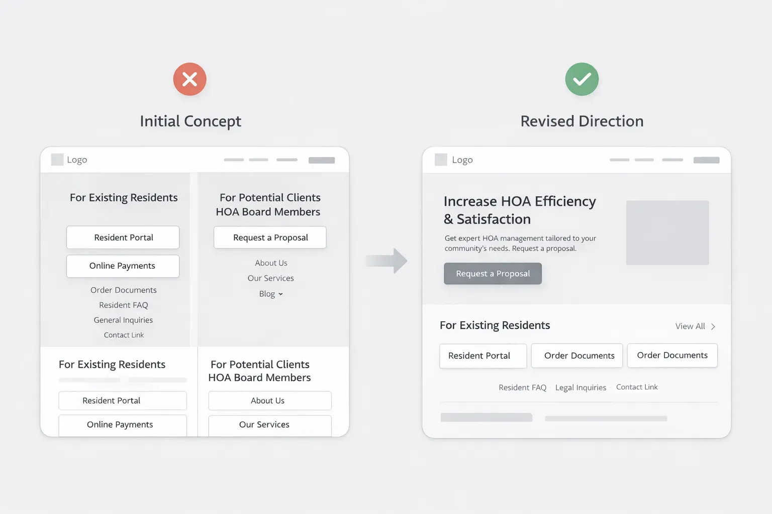
The existing Triquest site did not clearly communicate the company’s services, value, or professionalism. The discovery phase focused on understanding how residents, board members, and prospective clients might interpret the business at first glance, then identifying opportunities to improve clarity, trust, and navigation.

No items found.

Visual Systems

04

Font Selection

Manrope Bold

Heading Selection

Manrope Medium

Subheading Selection

Manrope Regular

Paragraph Selection

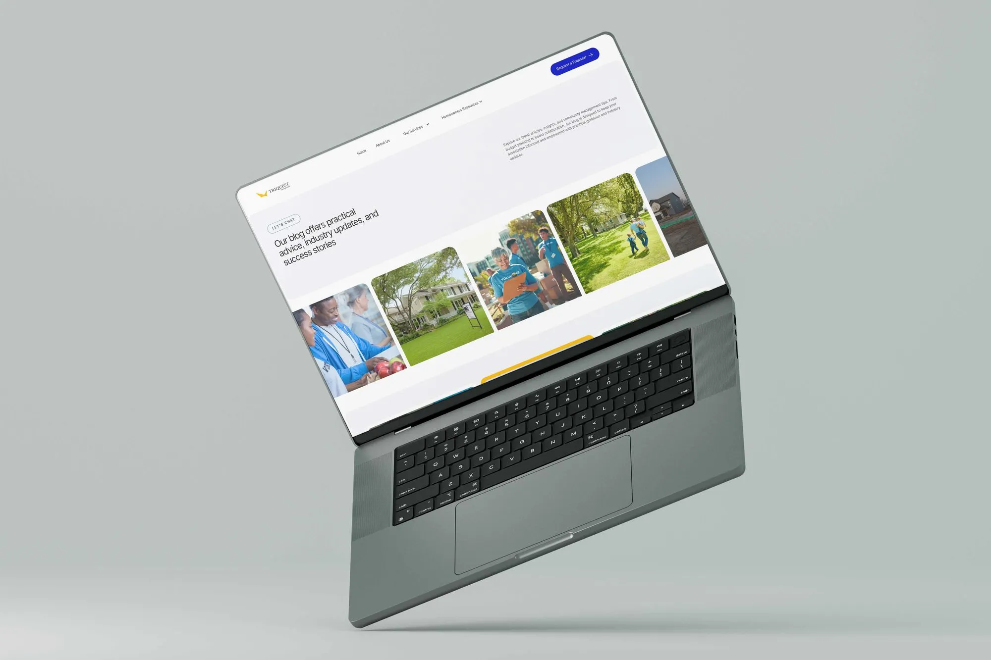
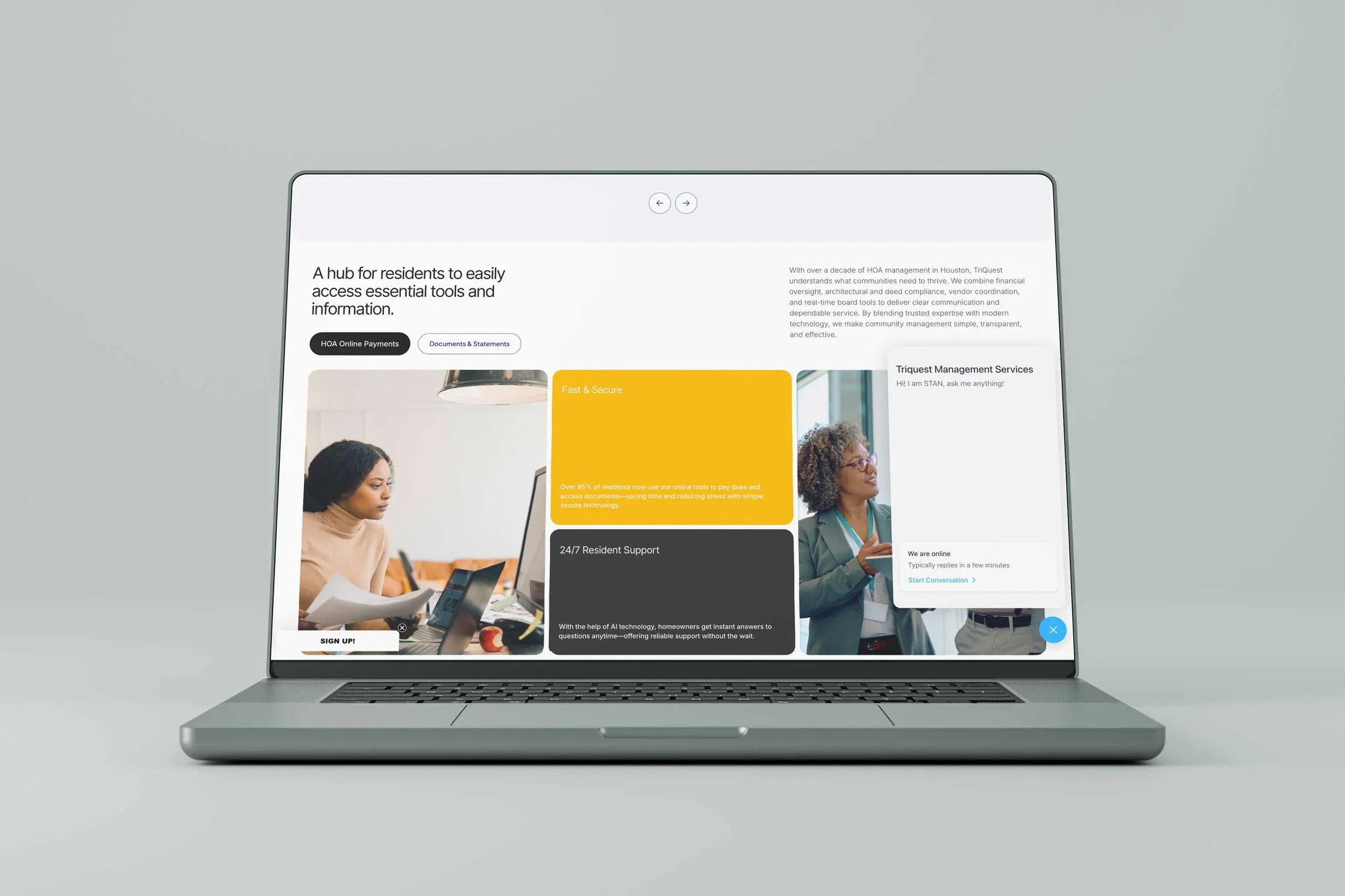
To rebuild TriQuest's credibility, I developed a new visual identity centered on professionalism and trust. The system features a clean color palette, modern typography, and a consistent set of reusable components to ensure a cohesive and intuitive user experience across the entire site.

Color Palette
[ TOKEN: PRIMARY ]
#030abc
[ TOKEN: SECONDARY ]
#f2b705
[ TOKEN: SURFACE ]
#232323
[ TOKEN: GRAY ]
#9c9c9c
[ TOKEN: NEUTRAL ]
#f6f7f9
[ TOKEN: WHITE ]
#ffffff
Buttons
[ Request a Proposal ]
[ Explore Services ]
Logo
[ ANNOTATED SCREENS ]

Solutions & Outcomes

05

[ SOLUTIONS ]
“We needed a digital presence that built trust fast.”
The challenge was to transform an outdated and unclear web experience into a more polished, readable, and trustworthy digital presence.
No items found.

[ Navigation ]

06

[ RELATED FILES ]

[ Contact ]

07

[ CONTACT ]
Start a project
[ RESPONSE WITHIN 48 HRS ]
> NAME:
> Email Address:
> Message:
[ OR EMAIL DIRECTLY — HELLO@AJWILLIAMS.INFO ]
Thank you! Your submission has been received!
Oops! Something went wrong while submitting the form.
boot.sh_ □ X
[ ]
Initializing0%