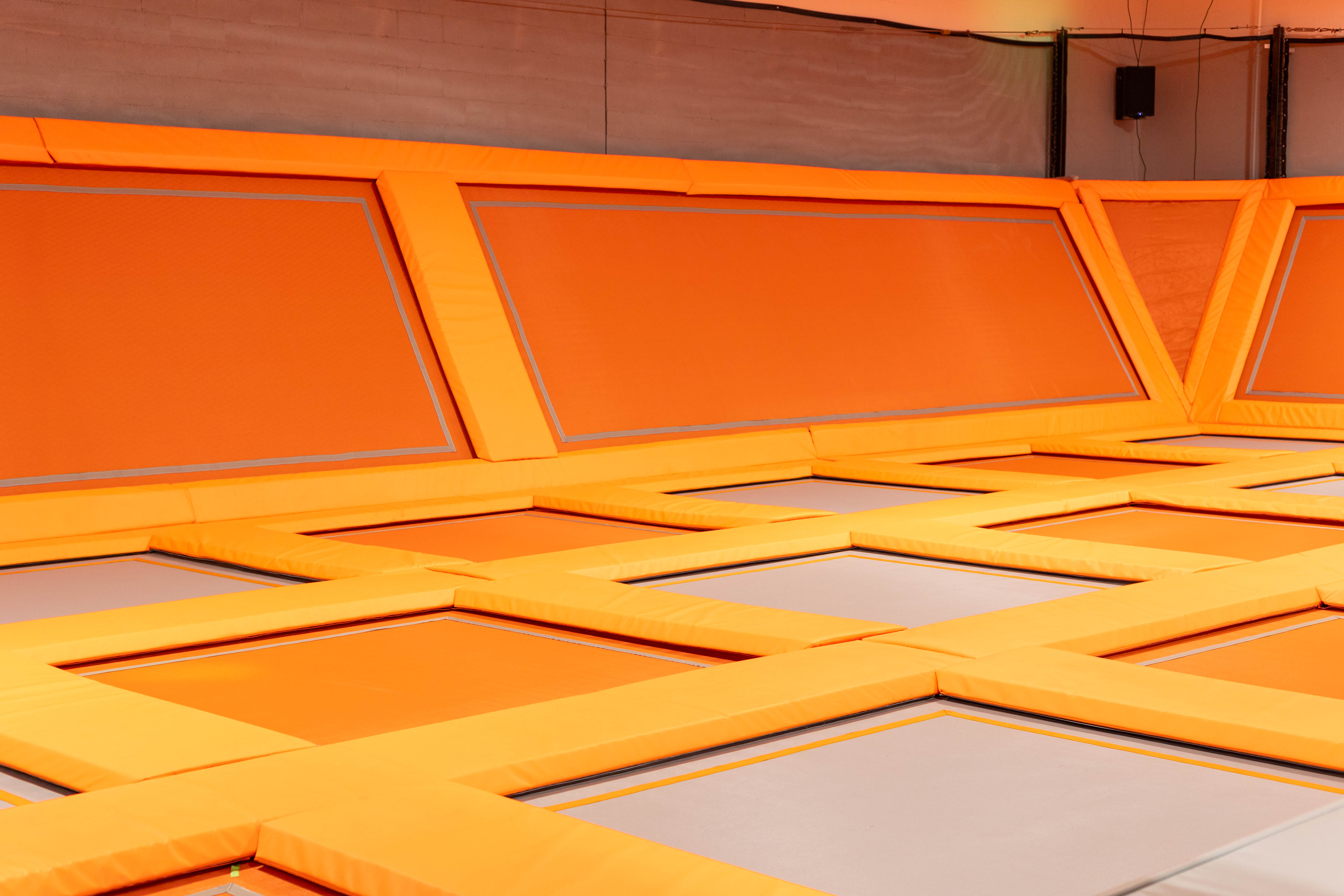
The Problem
As a senior designer at Swimm Social, I played a pivotal role in enhancing the visual identity of Big Air Trampoline Park, a leading trampoline park in the West Coast market. My involvement commenced shortly after the initial brand identity was established. I focused on developing updated collateral, including business cards, letterheads, flyers, posters, and brochures. Leveraging my expertise in brand design and art direction, I ensured the materials aligned with Big Air's energetic personality. Using industry-standard tools such as Adobe Illustrator for vector graphics, Photoshop for image editing, and InDesign for layout and print design, I integrated motion graphics elements to create cohesive and visually compelling collateral that resonated with the target audience. My contributions helped elevate the brand's dynamic appeal and strengthen its market presence.
The Strategy
My primary focus was on rebranding and updating various collateral pieces, such as business cards, letterheads, flyers, posters, and brochures. Leveraging my expertise in brand design and art direction, I aimed to bring a fresh and dynamic look to these materials, aligning them with Big Air Trampoline Park's energetic and vibrant brand personality.
The Outcome
To achieve these objectives, I utilized industry-standard tools such as Adobe Illustrator for vector graphics, Photoshop for image editing and manipulation, and InDesign for layout and print design. Employing a combination of design principles and motion graphics techniques, I aimed to create visually compelling and cohesive collateral that resonates with the target audience. The rebranded collateral not only aligned with the established brand identity but also injected a new level of dynamism and engagement. Through the integration of motion design elements, I successfully contributed to enhancing the overall visual appeal and market presence of Big Air Trampoline Park.
The Results
The updated collateral for Big Air Trampoline Park significantly enhanced the brand’s visual identity, leading to a boost in customer engagement and a 15% increase in party bookings. The vibrant and cohesive designs resonated with the target audience, improving brand recognition and strengthening the park’s market presence.